Interface Layout
The Prism interface is organized into three main areas: the Primary Left Panel, the Home Section (center), and the Right Panel.
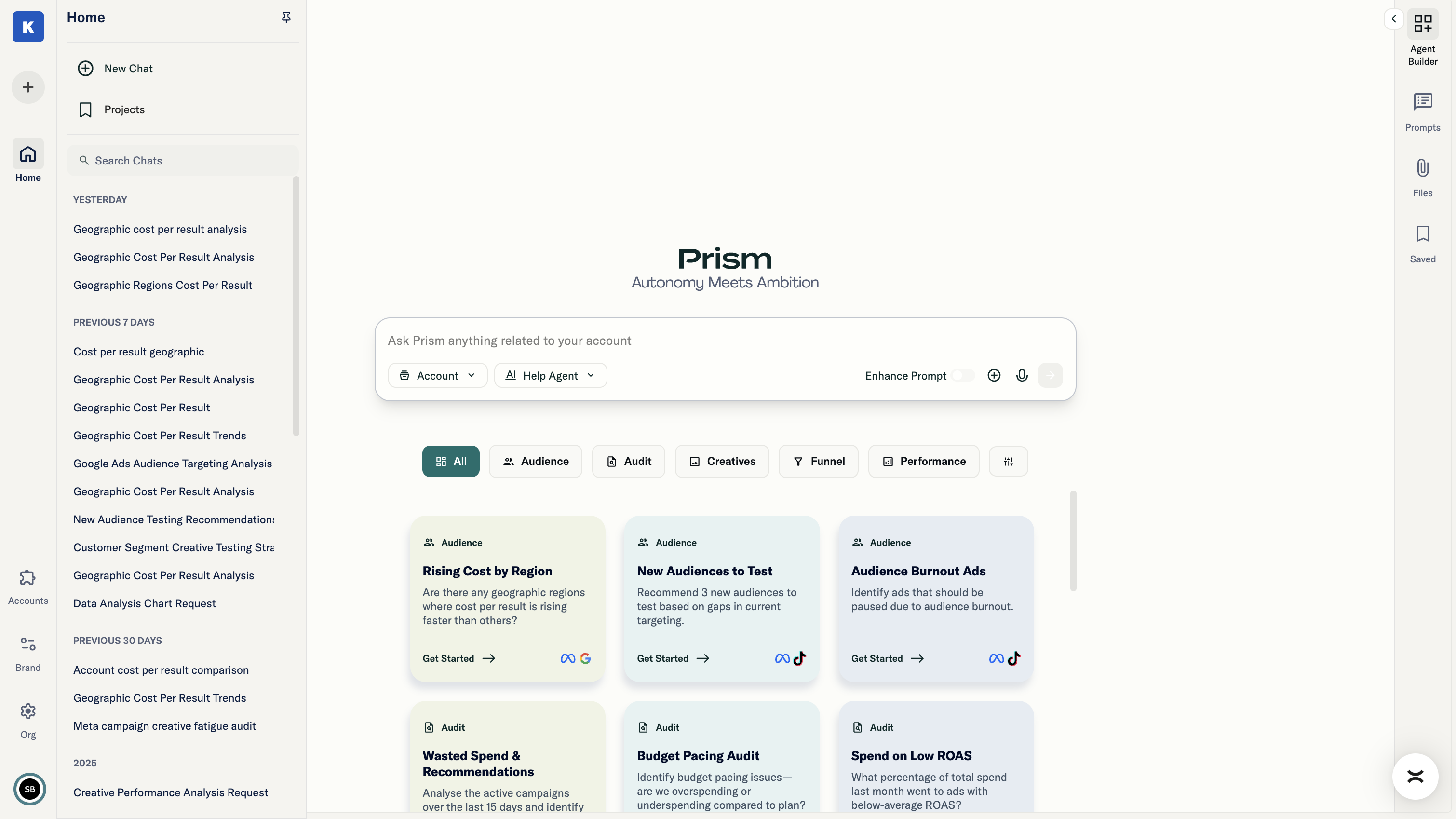
Primary Left Panel
The left panel provides navigation and access to settings.
Top Section
- Brand Switcher: Switch between different brands within your organization
Main Section
- Home: Access to the main chat experience
Bottom Section
- Brand Settings: Configure brand-level settings and team access
- Organization Settings: Manage organization-wide configuration, brands, and users
- Accounts: Connect and manage platform integrations (Meta, Google, TikTok, Google Sheets)
- User Settings: Access user profile, terms of service, privacy policy, help documentation, and general chat settings
Home Section (Center)
This is where Prism's core capabilities live. The Home section is the chat area where you interact with Prism.
- Secondary Left Panel (Chat History): View and access previous conversations
- Chat Area: The main interaction space where you select ad accounts, choose agents, and query your data
Right Panel
The right panel provides access to reusable assets and saved work.
- Prompts: Create and share prompt templates within your brand
- Saved Projects: View and manage all saved projects from this section
- File Manager: View and manage all previously uploaded files from this section